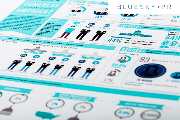
Research suggests that articles that feature relevant pictures receive up to 94% more views than articles that are made up of pure text. So it’s pretty surprising that so much content is still posted without relevant visual aids, especially considering that just over 65% of us are visual learners. Ensuring that your content is accompanied by a relevant photo or graphic is also key for social sharing.
Infographics are a great way to convey information in an engaging and memorable way, after all you want your audience to retain your messages not just read and forget them. So how can you create attractive and insightful infographics?

Use the data you have at your disposal
If your organisation has produced any research, or even just an internal survey, you can use this to form the basis of your infographic – remember not all information needs to be from a primary source, the majority of infographics incorporate information from a variety of sources.
Create a narrative
Large quantities of figures can seem a bit overwhelming, so read through all of the data sets and work out which angle is the most interesting. If you can create a flowing ‘narrative’ people are more likely to engage with the information and continue reading. Work out which figure is most relevant and likely to grab your audience attention and work from there.

Create a wireframe
Work out how you want to represent each individual fact or quote, and make sure there is plenty of variety. While some statistics might suit a pie chart, others might be better for a pictogram. Make sure that there is plenty of balance and that you aren’t just using one method to represent your data.

Make your infographic visually appealing
While some people opt to create a straightforward data led infographic, others will strive to make the data as eye-catching as possible using colours, illustrations and typography. Often the most effective infographics lie somewhere in between – interesting and original data which is presented in an aesthetically pleasing way.
Share your infographics across social media
As with all content, visual and written, the key to getting it seen, or read, is by pushing it out to your audience across your social media channels. This is arguably where infographics are the most effective, as users are far more likely to engage with easily consumable information than large sections of text.
So next time you create content based insights from research or a topic you have an authoritative voice on, consider producing infographics to accompany it and capture your audience’s attention.


